
What Makes a Website Mobile-Friendly?

A mobile-friendly website has a responsive design that automatically adjusts to different screen sizes. Navigation should be straightforward, loading speeds fast, and buttons or links easy to tap. Text should also be clear without requiring users to zoom in.
Additionally, images on your website should be optimized to maintain quality without slowing down load times. These elements ensure a seamless user experience, increasing the likelihood of bookings.
- Simplified Booking Process: Easy-to-fill forms and straightforward navigation allow potential students to book lessons anytime, anywhere.
- Increased Credibility: A responsive website makes your business appear professional and trustworthy.
- Enhanced Local SEO: A mobile-friendly site improves your rankings in local search results, making it easier for tourists to find your school.
Moreover, satisfied customers are more likely to leave positive reviews, further boosting your online reputation.
Steps to Make Your Surf School Website Mobile-Friendly

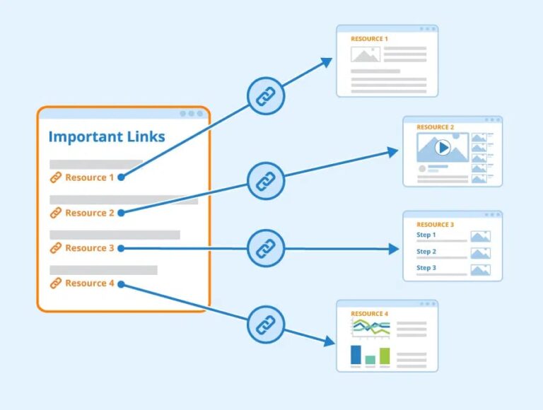
- Audit Your Website: Use tools like Google’s Mobile-Friendly Test to identify issues with your site. Regular audits are essential.
- Implement Responsive Design: Ensure your website adapts seamlessly to all screen sizes, from smartphones to tablets.
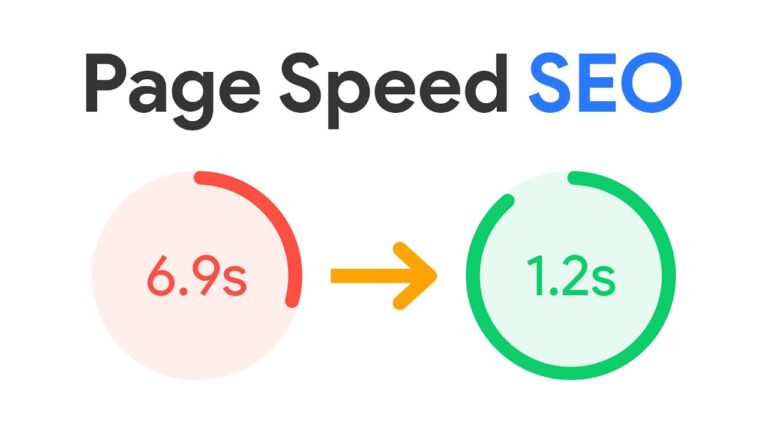
- Optimize Loading Speed: Compress images, enable browser caching, and fix any code that slows your site down.
- Streamline the Booking Process: Ensure your forms are user-friendly, and integrate a simple payment gateway.
- Regular Testing: Test your website across various devices to ensure it runs smoothly.
- Mobile Optimization Audits: Identify and fix issues on your website.
- Responsive Web Design: Ensure your site looks great on any device.
- Speed Optimization: Enhance performance to keep users engaged.
- Custom Booking Systems: Simplify the booking process for mobile users.
- Local SEO Integration: Improve visibility in local searches and on Google Maps.
With Noethera, your surf school website won’t just look great; it will perform at its best, attracting more bookings and opportunities.