Di era digital yang terus berkembang, punya website yang responsif mobile itu udah bukan pilihan lagi—tapi kewajiban. Di tahun 2025, dengan lebih dari setengah lalu lintas web global datang dari perangkat mobile, bisnis harus memastikan website mereka nyaman diakses dari smartphone. Bukan cuma soal kemudahan, desain responsif mobile juga langsung memengaruhi peringkat SEO, pengalaman pengguna, dan tingkat konversi, jadi ini elemen penting buat sukses online.
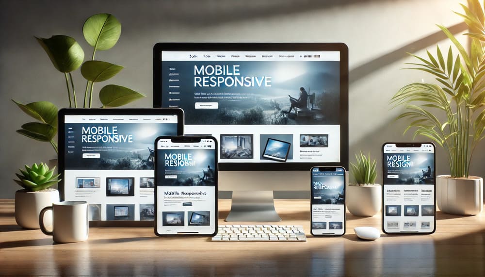
Pentingnya Desain Responsif Mobile
Desain responsif mobile bikin website bisa otomatis menyesuaikan dengan berbagai ukuran layar, baik itu smartphone, tablet, atau desktop. Jadi, user bisa lebih mudah jelajahin konten tanpa perlu zoom in atau scroll ke kiri-kanan. Karena semakin banyak orang pakai mobile buat browsing, website yang nggak responsif bisa bikin pengunjung kabur.
Di 2025, orang-orang pengen browsing yang cepat dan tanpa ribet. Kalau websitemu nggak nyaman diakses dari smartphone, pengunjung bakal gampang bosen dan langsung keluar. Ini berarti kamu bukan cuma kehilangan pengunjung, tapi juga peluang besar buat konversi. Jadi, kalau websitemu nggak responsif mobile, itu bisa jadi risiko bisnis yang serius.
Dampak Desain Responsif Mobile Terhadap SEO
Optimasi mesin pencari (SEO) masih jadi salah satu cara paling kuat buat ngedatengin traffic organik, dan di 2025, peringkat SEO lebih dipengaruhi oleh responsif mobile daripada sebelumnya. Google udah beralih ke mobile-first indexing, artinya mereka mengutamakan versi mobile dari konten websitemu buat penilaian dan peringkat. Kalau websitemu nggak responsif, jangan heran kalau ranking-nya jeblok.
Desain yang responsif mobile juga bikin websitemu lebih cepat loading-nya, dan kecepatan halaman itu jadi faktor penting buat peringkat di mesin pencari. Website yang cepat dan responsif lebih mungkin muncul di halaman pertama Google, dan itu penting banget buat ningkatin traffic serta konversi.
Selain itu, website yang responsif biasanya punya bounce rate yang lebih rendah karena user lebih betah lama-lama di sana. Kalau pengunjung tinggal lebih lama, ini kasih sinyal positif ke Google, yang bikin peringkat SEO-mu jadi naik. Jadi, kalau kamu mau websitemu tampil lebih baik di mesin pencari, desain responsif mobile adalah kuncinya buat strategi SEO yang sukses di 2025.
Meningkatkan Pengalaman Pengguna dengan Desain Responsif Mobile
Salah satu faktor paling penting buat suksesnya website adalah pengalaman pengguna (UX), dan responsif mobile berperan besar dalam hal ini. Desain yang responsif mobile bikin user bisa dengan mudah menjelajahi halaman, menemukan informasi, dan berinteraksi dengan konten tanpa ada kendala teknis. Di 2025, user makin menuntut lebih dari website, dan pengalaman mobile yang mulus jadi prioritas.
Desain yang responsif juga bikin tampilan websitemu konsisten di semua perangkat. Nggak ada lagi gambar yang kepotong atau tombol yang nggak bisa diklik, dan teks jadi lebih mudah dibaca tanpa perlu zoom. Ini bikin user lebih betah di websitemu dan lebih mungkin balik lagi di kemudian hari.
Pengalaman pengguna yang positif juga bisa ningkatin persepsi brand. Kalau pengunjung merasa puas dengan websitemu yang responsif, mereka lebih mungkin percaya dengan brand-mu, berinteraksi lebih lanjut, bahkan jadi pelanggan setia. Di sisi lain, pengalaman mobile yang buruk bisa bikin frustrasi dan ngerusak citra bisnis.
Pengaruh Desain Responsif Mobile Terhadap Tingkat Konversi
Saat pengunjung jadi pelanggan, desain responsif mobile bisa jadi faktor penentu. Entah itu buat daftar newsletter, belanja online, atau isi form kontak, website yang responsif bakal ngurangin hambatan yang bikin user gagal melakukan aksi yang diinginkan.
Pengguna mobile biasanya terburu-buru dan pengen pengalaman yang cepat dan mulus. Kalau mereka harus berhadapan dengan loading yang lama, tombol kecil yang susah diklik, atau tata letak yang membingungkan, kemungkinan besar mereka nggak bakal menyelesaikan aksinya. Sebaliknya, website yang responsif dengan navigasi yang jelas dan proses checkout yang simpel bisa banget ningkatin tingkat konversi.
Banyak bisnis melaporkan peningkatan konversi setelah mereka optimasi website buat pengguna mobile. Dengan semakin banyak orang yang berbelanja dan browsing lewat smartphone, desain yang responsif mobile langsung mempengaruhi kemampuan bisnis buat ngubah pengunjung jadi pelanggan. Di 2025, punya website yang bagus di mobile itu wajib banget kalau kamu pengen tingkat konversimu tinggi.
Kesimpulan
Memasuki 2025, desain responsif mobile makin penting aja. Ini bukan cuma soal ngikutin tren—tapi soal memberikan pengalaman yang mulus buat pengguna mobile yang bisa ningkatin peringkat SEO, pengalaman pengguna, dan tingkat konversi. Dengan Google yang lebih fokus ke mobile-first indexing dan makin banyak pengguna yang ngandalkan smartphone buat browsing, bisnis yang nggak optimasi website mereka buat mobile bakal ketinggalan.
Dengan berinvestasi dalam desain responsif mobile, bisnis bisa ningkatin SEO, menjaga pengunjung tetap engaged, dan ningkatin konversi. Kalau websitemu belum responsif mobile, sekarang saatnya buat ngejar biar bisnismu tetep kompetitif di tahun 2025 dan seterusnya.