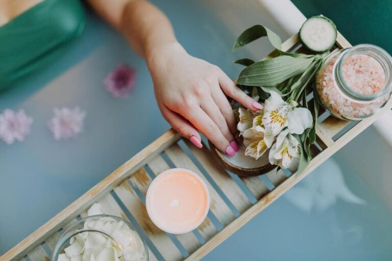
- Pastel Pink: Warna pastel pink sangat digemari karena memberikan kesan feminin, lembut, dan elegan. Warna ini sering digunakan dalam dekorasi ruangan yang menginginkan tampilan yang hangat dan ramah.
- Biru Pastel: Biru pastel memberikan nuansa yang segar dan tenang, membuatnya populer dalam desain interior dan fashion. Biru pastel sering dipilih untuk menciptakan suasana yang rileks, terutama dalam ruang-ruang seperti kamar tidur atau ruang tamu.
- Hijau Pastel: Hijau pastel dikenal mampu memberikan kesan alami dan menyejukkan. Warna ini cocok untuk ruang kerja atau ruang terbuka yang ingin menonjolkan unsur kesegaran.
- Kuning Pastel: Kuning pastel membawa keceriaan tanpa terlalu mencolok. Warna ini ideal untuk menciptakan suasana ceria dan hangat dalam ruang yang membutuhkan pencahayaan dan energi positif.
- Warna Dinding: Menggunakan warna pastel sebagai warna dinding bisa memberikan kesan ruang yang lebih luas dan cerah. Pilihan warna seperti biru pastel atau hijau pastel pada dinding ruang tamu bisa menciptakan suasana yang tenang dan menenangkan.
- Wallpaper Warna Pastel: Untuk tampilan yang unik, Anda bisa menggunakan wallpaper warna pastel dengan pola minimalis. Wallpaper ini bisa menjadi pilihan untuk satu sisi dinding sebagai aksen, sementara dinding lain menggunakan warna netral.
- Aksesoris dan Furnitur: Jika Anda tidak ingin mengubah warna dinding, tambahkan aksesoris seperti bantal, karpet, atau tirai dengan warna pastel untuk memberikan sentuhan warna yang lembut. Warna pastel juga cocok untuk furnitur seperti sofa dan meja kopi, terutama bila dipadukan dengan elemen kayu.
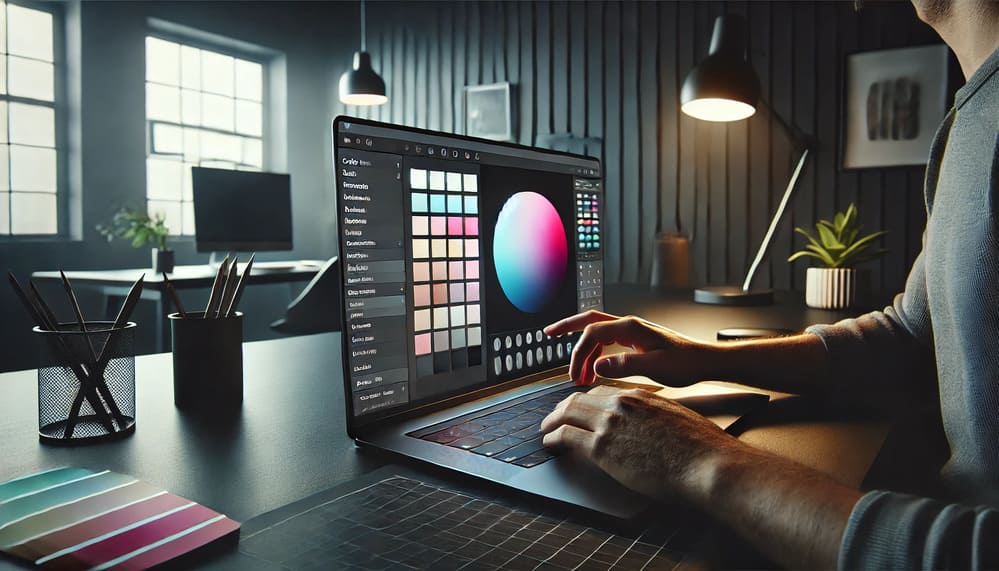
- Pastel Pink: #FFB6C1
- Biru Pastel: #B0E0E6
- Mint Green: #98FF98
Dengan mengetahui kode warna ini, Anda dapat mengaplikasikannya dengan mudah dalam desain digital, baik untuk website, aplikasi, atau media sosial.